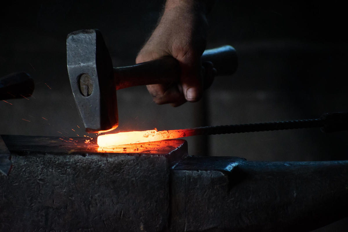
In the world of Contact Center testing and monitoring, aka Contact Center Assurance, the Hammer product name is both well-known and highly regarded amongst existing customers such as Maximus and T-Mobile. Yet, despite limited brand recognition outside of the contact center world, more than 15% of the Fortune 500 companies use Hammer to improve the customer experience for billions of interactions. Hammer does what it says on the tin by mimicking real-life scenarios through ‘hammering’ contact centers with simulated traffic, testing the ability to cope with and adapt to the omnichannel-driven needs of customers and agents, and new technologies, through constantly changing business requirements. The Hammer brand is similar to other well-known Infovista products within their respective specializations, such as TEMS and Planet. In some cases, brand recognition exceeds that of the parent Infovista brand. This is a key reason to claim back this brand; to differentiate Hammer from the rest of Infovista, because we fundamentally serve different end-customers.
Renewed strategic focus
Yet our desire to rebrand Empirix – which we acquired in April last year – was to align with its most well-known industry brand as part of a broader strategic aim for Infovista. As a result, over the previous seven months, we fully integrated the Empirix Experience Assurance solution KLERITY™ into our portfolio dedicated to next-generation network management under the Infovista umbrella straightaway. So now Empirix, including the rebrand and transition to Hammer is enjoying revenue acceleration and a renewed strategic focus!
Hammer and our brand values
To support our business unit dedicated to Contact Center Assurance, we created a new brand that reflects our company values better. An identity to highlight our market leadership position that we work hard to maintain. And a personality to support our commitment to building long-term customer relationships and improving communication with customers and partners.
While our logo has changed, the spirit of Hammer remains a symbol of quality, innovation and technology solutions that keeps pace with changing customer and business requirements throughout the Contact Center lifecycle and in a rapidly evolving environment.
Equally, our company values shape every aspect of our business and reflect the new branding:
- Outcome-Driven: Optimize ROI for our customers and partners to deliver the best CX for end-users.
- Trusted Partnership: Operate successfully in mission-critical and regulated environments.
- Operational Flexibility: Platform-agnostic with on-premises, hybrid and cloud subscription-based options.
- Customer Commitment: Proactive approach to detect and solve issues before they become problems.
- Global Capability: Communicative, expert teams providing personalized CX to our customers worldwide.
Hammer’s brand positioning strategy focuses on what we do best and the critical customer priority as illustrated by a new strapline: ‘Making Customer Experience Work’.
Visual identity and design principles
Research involving customers, partners and internal employees forms the basis of our new visual identity. We launched a mission to find a memorable, bold and iconic key visual, that could synthesize a simple yet unique brand promise: to proactively improve any Call Center by confronting it with the most developed test and monitoring software yet; Hammer. That’s why the hammer becomes such an important and powerful visual tool. Just like the “Intel Inside” seal, the logo identifies a leading, recognised and unrivalled technology.
For this reason, we emphasise the iconic “hammer” integrated within the logo to make it readable and for use as a standalone mark in multiple environments, such as digital media including social channels, brochures and collateral, and physical elements such as merchandising.
Another characteristic of this rebrand is the bright shiny green which becomes a critical visual differentiator for the Hammer identity. The business adopted this color in 2015 when Empirix updated its brand, but we have taken this to an entirely new level to stand out from the pack in a crowded online space as well as to represent the positive, proactive and innovative mindset of our teams, being able to transform an idea into a leading world-wide recognized standard.
Finally, I’d like to highlight another fundamental detail, “the triangle”, at the top corner of visual formats. The rationale is to prolong the impact of the hammer after the “hit” and represents the long-lasting influence our business has on the customer experience.
I hope you all enjoy the new Hammer visual identity. A big thank you to Morillas, our brand agency, headed by Marc Morillas, for supporting us on our journey.
Please feel free to provide feedback on the rebrand here: alexandre.lecoq@infovista.com


